
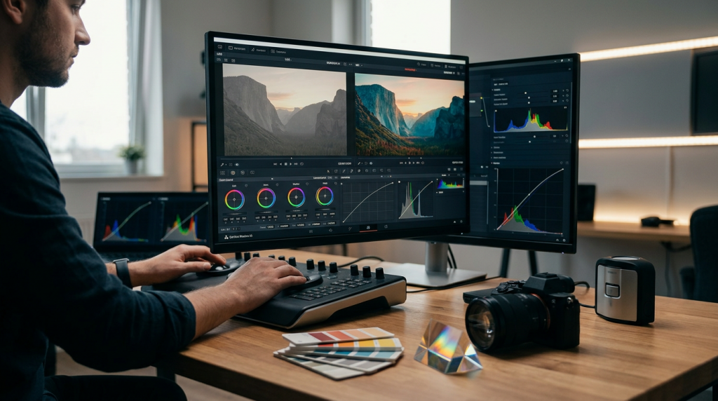
In previous posts, we discussed the technical side of color correction—getting your exposure and skin tones perfectly balanced. Today, we move into the “artistic” phase: Color Grading.
Many editors rely on generic LUTs they find online. While these can provide a quick “vibe,” they often lack depth and can fall apart the moment you change lighting conditions. To truly elevate your work and establish a professional brand, you need to stop applying LUTs and start building your own “Show LUT” or custom grading preset.
1. Color Grading vs. Color Correction
Before you touch a single slider, remember the golden rule: Correction comes first. Your image must be technically neutral (balanced white point, correct exposure) before you apply creative color. If you apply a creative grade to an uncorrected image, you are just masking technical flaws, which will make your final output look muddy and unprofessional.
2. The Logic of a “Show LUT”
A “Show LUT” is a consistent, repeatable color style that defines the mood of your project. Think of it like a photographer’s signature filter or a film director’s aesthetic. To build one that actually works, follow these three steps:
- Step A: The Mood Shift: Decide on your story’s emotional goal. Are you going for a warm, nostalgic documentary feel? Or a cold, sharp, high-contrast tech look?
- Step B: The Primary Grade: Use the Lumetri Color Wheels to push your shadows toward a specific hue (e.g., cool teals) and your highlights toward the opposite (e.g., warm oranges). This “Teal and Orange” contrast is a classic for a reason—it creates immediate depth between the foreground subject and the background.
- Step C: The Saturation Balance: Professional grades often involve selective desaturation. You might push the saturation of your skin tones (using the HSL Secondary tab) while pulling back the saturation of the background environment. This creates a “pop” that naturally draws the viewer’s eye to the person speaking.
3. Creating a Reusable Preset
Once you have dialed in a grade that you love, don’t just leave it on one clip.
- In the Lumetri Color panel, click the three-line menu icon.
- Select “Save Preset.”
- Name it something descriptive, like “Doc_Style_Warm_Contrast.”
Now, you have a professional-grade look that you can apply to any new project. However, don’t treat it as a final step. Once the preset is applied, you will still need to tweak the Basic Correction sliders for each specific shot to ensure the preset lands correctly on the new footage.
4. The “Print” Technique (The Advanced Pro Secret)
If you want your footage to feel like it came from a cinema camera, focus on the Curves.
- Instead of using the “Contrast” slider (which is a blunt instrument), use the RGB Curves to create a very subtle “S-Curve.”
- Pull the “Blacks” slightly off the bottom-left corner of the graph. This gives your footage a “lifted black” look, which is a hallmark of high-end, filmic aesthetics. It removes the harsh “digital black” and makes the image feel organic and soft.
5. Don’t Overcook It
The biggest sign of an amateur colorist is “over-grading.” If your subject’s skin looks like it was spray-tanned neon orange, or your shadows are so crushed you can’t see detail, you’ve gone too far.
The 80/20 Rule: Your grade should be subtle enough that the viewer doesn’t notice the “color” itself—they should only feel the “mood” the color creates. If the audience is thinking about your color grade, you’ve done it wrong. If they are emotionally engaged by the story, you’ve done it perfectly.
Do you have a “go-to” color aesthetic for your projects, or do you find yourself experimenting from scratch every time? What’s one movie or documentary whose “look” you’ve always wanted to replicate? Let me know below—I’d love to help you break down the color science behind it!
Leave a Reply