
In the world of high-end video production, color grading is the bridge between a “home video” look and a “cinematic” experience. As editors, we often rely on pre-made LUTs (Look-Up Tables) to give our footage a quick, stylized feel. However, if you are working on documentary-style projects or corporate content where consistency is paramount, relying solely on LUTs can lead to skin tones that look sickly or environments that lose their natural detail.
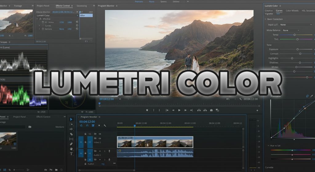
Professional color grading is not about “slapping on a filter.” It is a surgical process of balancing exposure, contrast, and hue to guide the viewer’s eye. If you want to elevate your editing, you need to master the Lumetri Color panel in Adobe Premiere Pro by working with Scopes rather than just your eyes.
The “Scope-First” Mindset
The biggest mistake amateur editors make is color correcting based on their monitor. Displays vary wildly in brightness and color reproduction. Your audience’s screen might make your video look too dark, while another person’s screen might make it look washed out.
This is why Lumetri Scopes are non-negotiable. When you open the Lumetri Scopes panel in Premiere, you are looking at mathematical data.
- The Waveform Monitor: This is your best friend for exposure. It tells you exactly where your blacks, highlights, and mid-tones sit. For a professional look, your shadows should approach (but rarely touch) the 0 line, and your highlights should rarely exceed 100.
- The Vectorscope: This is vital for skin tones. If you are editing an interview, you want your subject’s skin tone to fall along the “flesh tone line” (the diagonal line running from the center toward the orange/red area). If it drifts toward green or magenta, the viewer will subconsciously feel that something is “off.”
Mastering the Workflow: A Three-Step Approach
To ensure consistency across a multi-cam documentary project, follow this professional sequence:
- Corrective Balancing (Technical): Before adding any style, fix the technical errors. Use the “Basic Correction” tab to adjust White Balance (using the White Balance selector on a neutral gray or white object) and Exposure. Use your Waveform to ensure the image is correctly exposed across the entire frame.
- Contrast and Curves (Creative): Don’t use the standard Contrast slider. It is a “blunt instrument” that crushes blacks and blows out highlights. Instead, use the RGB Curves. By creating a subtle “S-Curve,” you can deepen the blacks and brighten the highlights precisely, keeping the mid-tones—where most skin detail lives—intact.
- Secondary Correction (Surgical): This is where documentary work shines. Use the HSL Secondary tab to isolate specific colors. If you have a blue wall behind an interviewee that is distracting, you can use the eye-dropper tool to select that blue, desaturate it slightly, and shift the hue toward a more muted, neutral tone. This keeps the focus entirely on the subject.
Example: The “Interview Consistency” Challenge
Imagine you are editing a documentary about the oil industry. You have interviews from three different locations: a bright office, a dimly lit archive, and an outdoor field site. If you edit these together without grading, the jump in color will be jarring.
- The Solution: Pick your best-exposed interview as your “Hero Clip.” Grade that first. Then, move to your second clip, open your Reference Monitor (to see the Hero side-by-side), and use the Lumetri color wheels to match the shadows and highlights of the second clip to the first.
- Pro Tip: Use an Adjustment Layer over the top of your entire timeline to apply a global “film-like” grain or a subtle warming effect. This “glues” the disparate footage together, making it feel like a cohesive documentary rather than a collection of separate clips.
Consistency = Professionalism
When I was working on my own documentary projects, I found that creating a “Look Preset” was a game-changer. Once I established a grading style that worked for my subject matter, I saved it as a preset. However, I always kept the “Basic Correction” settings separate. This allows me to apply the same “look” to different projects while ensuring every individual clip is balanced correctly first.
Color is storytelling. A cold, desaturated blue grade tells the viewer that the subject is serious or technical. A warm, saturated gold grade can evoke nostalgia or warmth. By mastering the tools inside Premiere, you stop guessing and start painting with light.
Do you struggle with matching colors between different cameras, or do you find yourself relying on LUTs for everything? What is one “grading nightmare” you’ve encountered recently? Let’s break it down in the comments—I’d love to help you solve it!
Leave a Reply